
CURTAINS
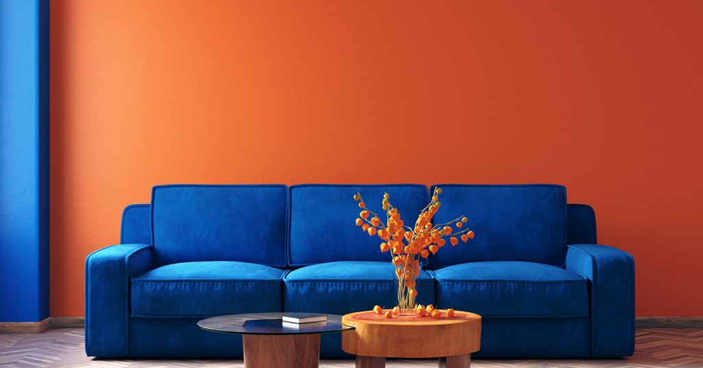
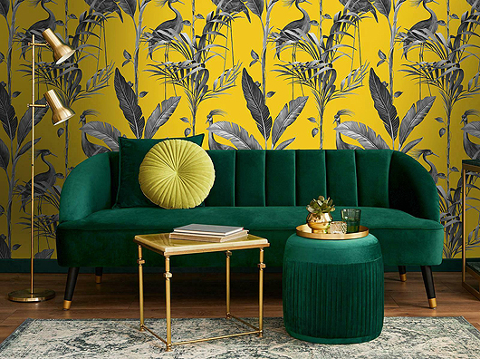
Best Colour Combinations in Upholstery


Related Posts

CURTAINS
People have been sewing since ancient times. From...

CURTAINS
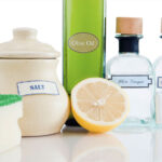
Wine stains, grease and coffee stains are among...